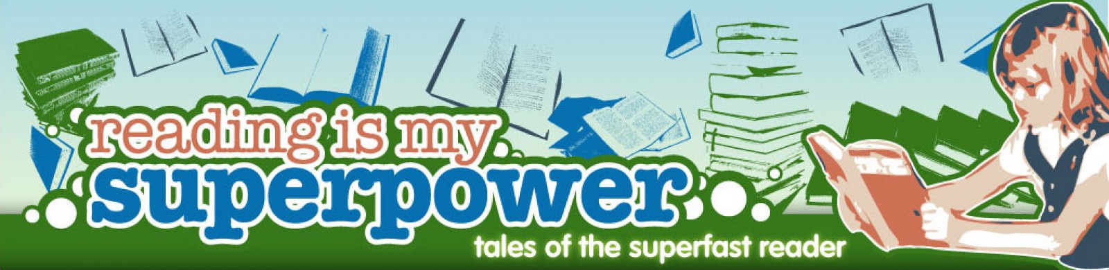
I just spent the last 90 minutes hacking the Cutline Theme to bits to create what I think is a much more user-friendly layout. It feels much cleaner to me. Of course, it still features my kickass banner by Hevan Chan.
I’d definitely love feedback/suggestions…
I think this is fine, Annie. I think some elements like your Shared Items from Google Reader are much more noticeable.
I dig it. You’re right, it’s much more user-friendly than the previous one. Much easier to browse and notice things, esp. in the sidebar. Good job!
Thanks!!
I like it. It’s a clearer layout – feels less cluttered and easier to spot stuff at a glance – and for some reason, I find it easier to read with the side bar on the right than the left – but that may just be me.
I know what you mean, Ted–I find it easier to read, too.